Ella in the Arctic
Creating a brand & website that serves as a living logbook of Ella’s impossible journey. Allowing followers to track her route in real time, read journal entries and learn about the climate issues she’s witnessing firsthand.
3D Graphics
Branding
Editorial
Illustration
UI/UX

About the Project
Ella Hibbert, a 28 year-old British sailor, will attempt to make history in 2025. In a world-first voyage, Ella will travel alone across 10,000 miles of sea to showcase the impact of climate change in the Arctic.
Ella needed a brand to represent her journey, and a site where she could post updates alongside her journey to keep everyone up to date. The site follows the entirety of her journey, from start to finish and beyond. Including daily updates, monthly recaps and a live tracker.
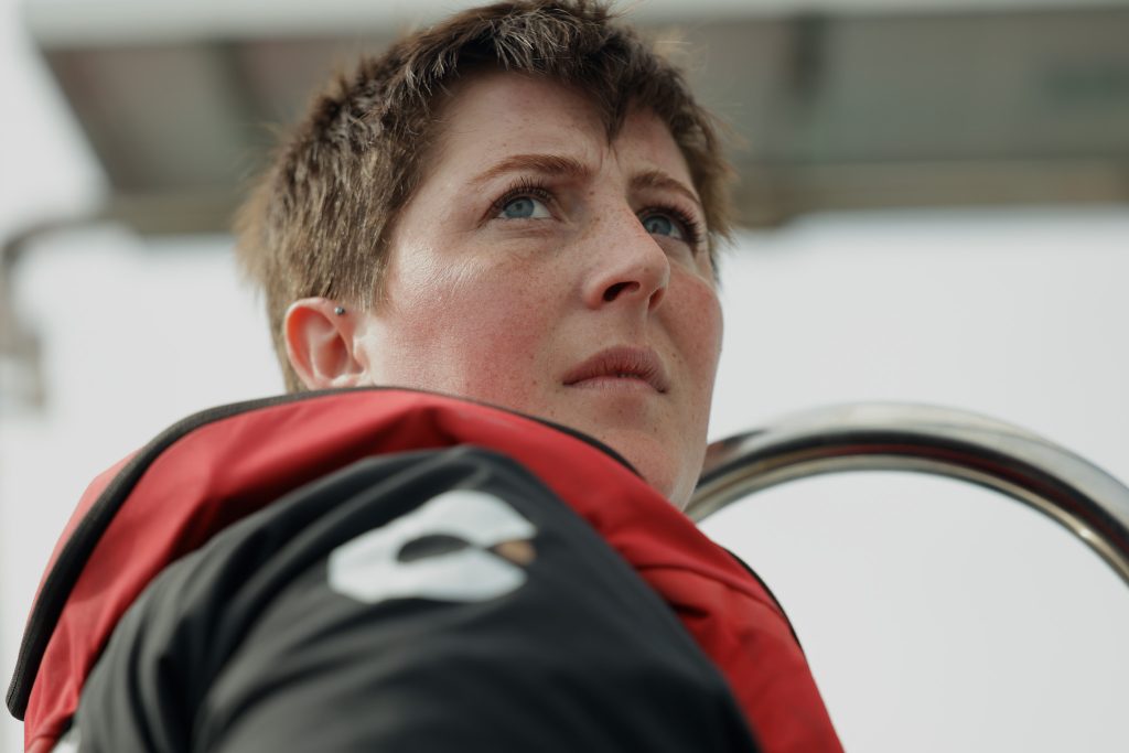
photo © ellainthearctic.co.uk
About the Brand
We wanted to create a brand that subtly blended the Artic circle with circumnavigation, in a clean, modern fashion. Designed for clarity and impact, the logo remains instantly recognizable both up close and from a distance – whether displayed on a phone or painted on the hull of the boat.
E for Ella
The inward-pointing arrows subtly form four E-shapes, echoing Ella’s name and symbolizing direction, focus, and personal journey.
Navigation
The arrows symbolize navigation and convergence, while their symmetrical form subtly resembles a snowflake, evoking Arctic travel and frozen landscapes.
Arctic Circle
The outer circle represents the Arctic Circle, enclosing the design like our planet, highlighting both geographic focus and environmental urgency.
01
E for Ella
Here goes your text … Select any part of your text to access the formatting toolbar.
02
Navigation
Here goes your text … Select any part of your text to access the formatting toolbar.
03
Arctic Circle
Here goes your text … Select any part of your text to access the formatting toolbar.
01
E for Ella
Here goes your text … Select any part of your text to access the formatting toolbar.
02
Navigation
Here goes your text … Select any part of your text to access the formatting toolbar.
03
Arctic Circle
Here goes your text … Select any part of your text to access the formatting toolbar.
01
E for Ella
Here goes your text … Select any part of your text to access the formatting toolbar.
02
Navigation/Snowflake
Here goes your text … Select any part of your text to access the formatting toolbar.
03
E for Ella
Here goes your text … Select any part of your text to access the formatting toolbar.
01
E for Ella
Here goes your text … Select any part of your text to access the formatting toolbar.
02
Navigation
Here goes your text … Select any part of your text to access the formatting toolbar.
03
Arctic Circle
Here goes your text … Select any part of your text to access the formatting toolbar.
Colour Palette
The chosen colour palette is deeply symbolic, drawing inspiration from the Arctic seascape and the urgent environmental narrative surrounding it.
The blue shades represent the vastness and depth of the ocean, and the icy, shifting landscape of the Arctic. One blue evokes the cold, dense waters that cut through the polar regions, while the lighter tone echoes the fragile clarity of sea ice – a natural element now under increasing threat due to climate change.
The yellow acts as a striking counterpoint, it symbolizes both hope and warning. It reflects the warmth of the sun, but also hints at the rising temperatures that accelerate ice melt. In the context of navigation and sea travel, yellow is a color often used for visibility and caution – an appropriate metaphor for the delicate state of Arctic ecosystems.
Glacial Current
Hex #0099ff
RGB 0/153/255
Midnight Depths
Hex #140F2D
rgb 20/15/45
Sunlight Warning
Hex #ffff77
rgb 255/255/120
Fading Ice
Hex #F0F0E6
rgb 240/230/230
Glacial Current
Hex #0099ff
rgb 0/153/255
Typography
The primary typeface of this project was Founders Grotesk.
Chosen for it’s ability to convey both the boldness of Arctic exploration and the clarity needed for storytelling and environmental messaging.
Visual Device
We created a visual device as a supporting graphic to help bolster the idea of an expedition shaped by plotted points, representing an unfolding journey. Capturing movement, progress, and the evolving, but often uncertain path of solo Arctic exploration.